What's New
Product updates, improvements and fixes across the KlickAnalytics platform.
📢 All Earnings Call Transcripts in One Place
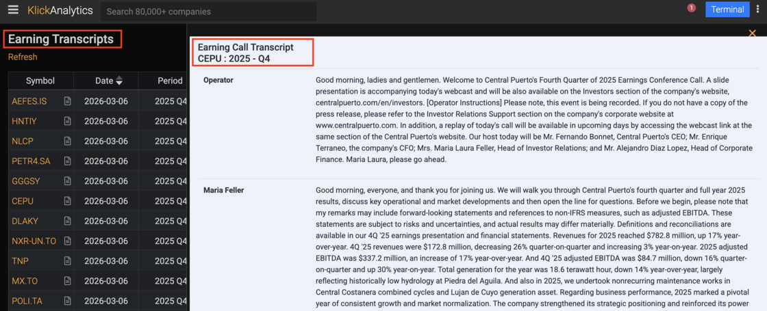
You can now access the latest earnings call transcripts from companies around the world directly within KlickAnalytics. Instantly read management discussions, analyst questions, and key insights from earnings calls — all in one place.
To access: Click on menu bar, and click on Transcripts
🚀 New App Navigation — Everything at Your Fingertips
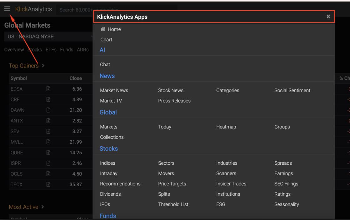
We’ve introduced a new modern navigation panel that makes it easier than ever to explore KlickAnalytics. Instantly access charts, AI tools, news, markets, stocks, and more — all from one sleek menu.
Just click the menu bars (☰) to open the new KlickAnalytics Apps panel. All features — from AI to market analytics tools — are now available in a clean, modern navigation designed for speed and simplicity..
Everything you need is now just one click away.
🚀 3D Candle Charts!
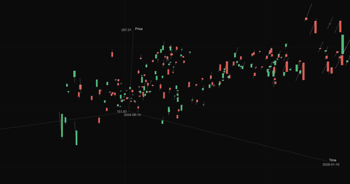
We just changed how you see the market.
Introducing 3D Candles at KlickAnalytics.
- This isn’t a fancy chart.
- It’s a new way of thinking.
Price stays on the chart — but now any metric becomes height: Volume. Returns. Volatility. ATR. Wick pressure. Gaps. Momentum.
What happens when you do that?
- Market regimes appear as clusters
- Extreme days rise above the noise
- Patterns stop being abstract — they become visible
- You can select a group of candles and measure what actually happens next
Follow-through. Mean reversion. Volume confirmation. Tail risk.
No guessing. No vibes. Just structure.
Most tools show you what happened. This shows you where it matters.
This is how market intuition is built — faster, deeper, clearer.
To view: Select Tools > Visualizations > 3D Candles
🚀 Introducing Seasonal Edge
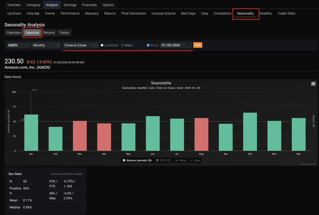
🚀 Introducing Seasonal Edge — Market Seasonality Done Right
We’re excited to launch Seasonal Edge, a powerful new tool inside KlickAnalytics that reveals how markets actually behave over time — backed by data, not anecdotes.
Seasonal Edge analyzes historical returns across months, weeks, and other time buckets to show when a symbol has historically performed better or worse, and by how much.
🔍 What makes Seasonal Edge different?
📊 Probability, not predictions
- See the percentage of positive vs. negative periods for each time bucket, clearly visualized in green and red.
📈 Real return distribution
- Go beyond averages with P25 / P75 bands, median, min/max, and raw return points — so you understand risk, not just direction.
🧮 Multiple return calculations
Close-to-Close
Open-to-Close
Log Returns
Switch instantly and see how seasonality changes.
⏱ Flexible time controls
- Lookback by years
Or analyze from a specific “Since” date
- Automatically limited for free users, fully unlocked for PRO
🧠 Context-aware insights
“Now” marker highlights the current period
Hover any bar or point to see detailed bucket statistics instantly
To view: Search for any symbol, click on Seasonality > Seasonal
🟠 Meet the New Global Symbol Navigation: Faster, Simpler, Smarter.

We’re excited to announce a major improvement to the way you explore the markets inside KlickAnalytics — our new, unified Global Symbol Navigation.
Whenever you open a symbol, you now get a simple, elegant, and fully visible navigation bar that brings together everything you need to understand a stock at a glance:
- Pricing and intraday views
- Technical analysis, returns, and performance
- Events, seasonality, correlations, volatility, and more
All the specialized analytics you've come to expect from the platform. Just a clean, intuitive navigation system that shows the full depth of our analytics in a single horizontal view.
This new design makes research feel faster, lighter, and more fluid, giving you the power of a global financial terminal with the simplicity of a modern web app.
And best of all:
The same experience is now available on mobile.
This upgrade is part of our mission to make KlickAnalytics the most comprehensive, easy-to-use financial intelligence platform in the world.
To access: Search for any symbol say AMZN and then select any of the global information from the top tabs showing as per image.
🚀 Meet Quick Window – Multi-Window Mode for Power Users
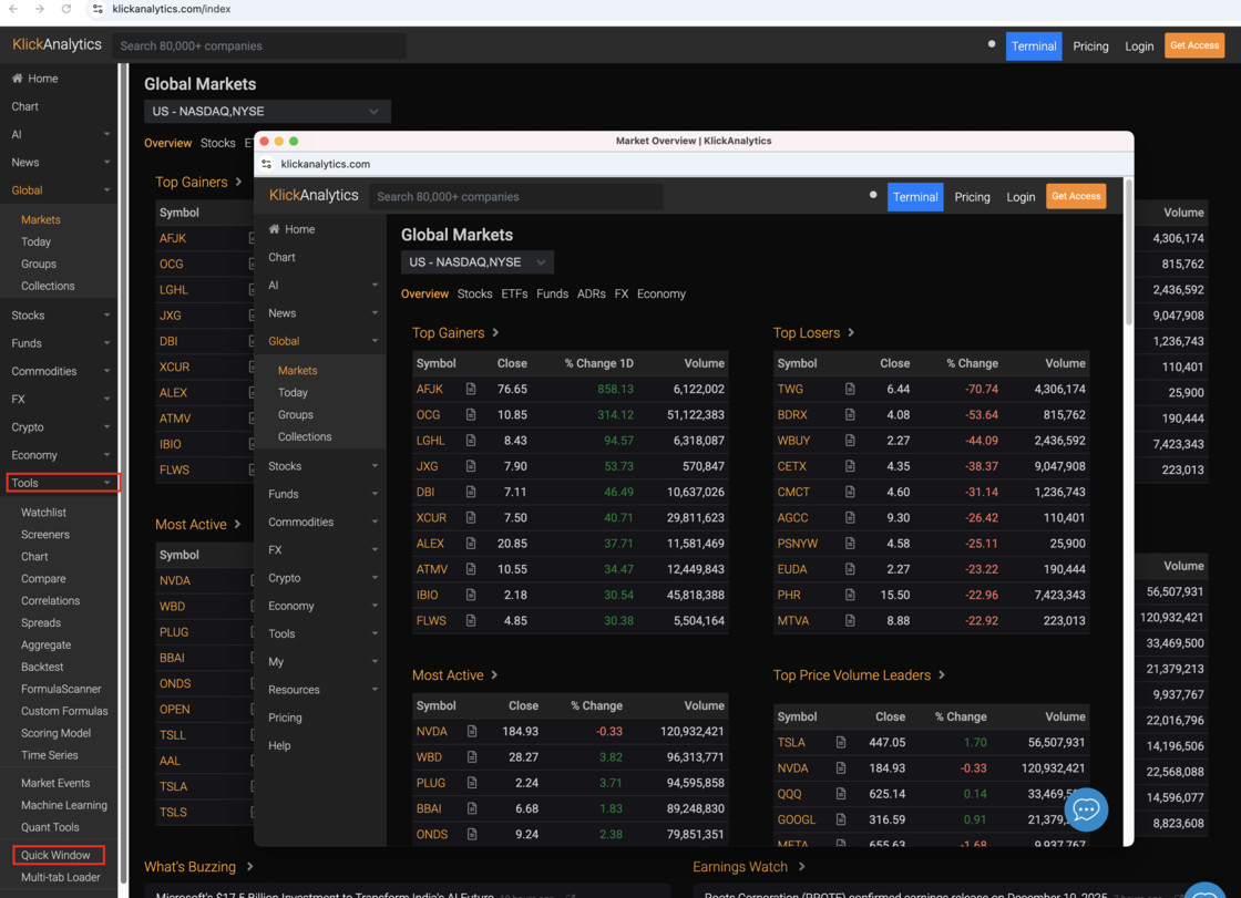
Now you can open KlickAnalytics in as many windows as you like. Use one window for global markets, another for your watchlist, a third for intraday charts – all live, all synced to your account.
Highlights:
Open multiple KA windows with a single click from Tools → Quick Window
Arrange windows across monitors for a true trading-desk layout
Each window keeps your theme, watchlists, and layouts
Close them anytime – your settings stay saved
Perfect for multi-monitor or side-by-side setups
Works with markets, charts, screeners, news, and more
To access: From the Menu > Tools > Click on Quick Window
Instant Access to Chart, Watchlist & Screener!
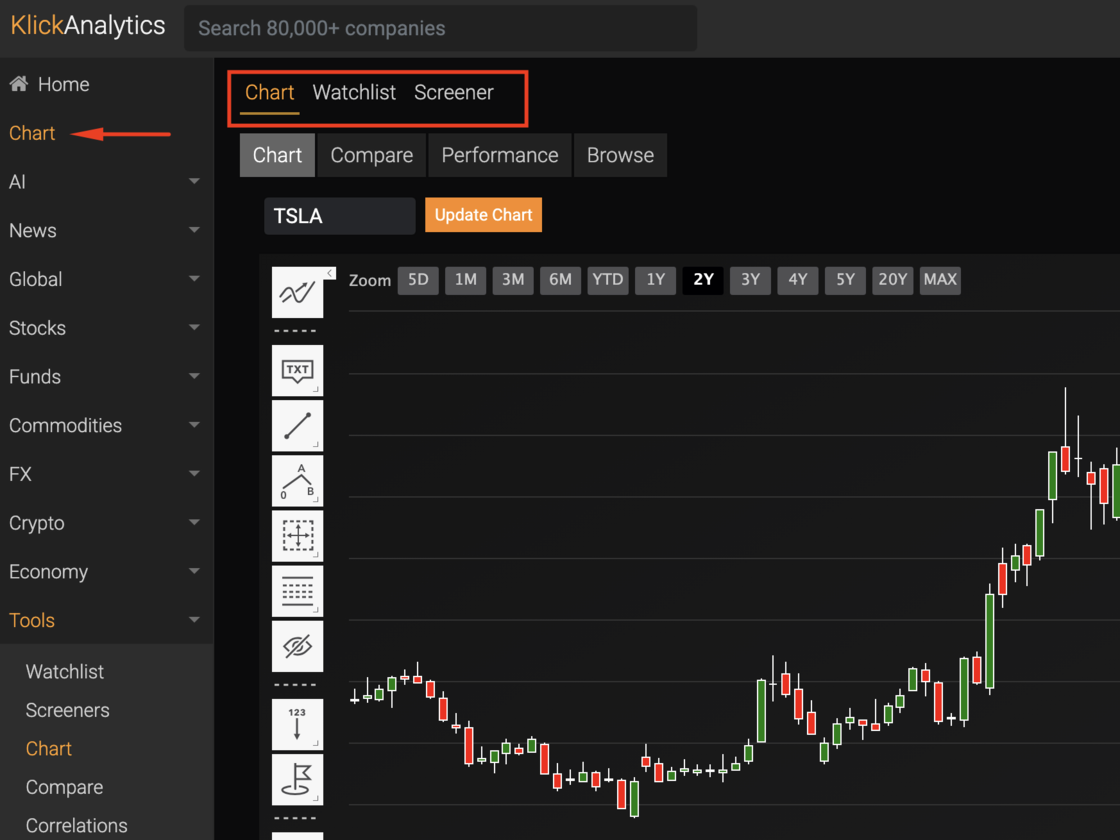
You can now jump straight into Chart, Watchlist, and Screeners from a single view.
We’ve streamlined your workflow by bringing the Chart, Watchlist, and Screener together in one unified space. You can now move between analyzing a symbol, reviewing your favorite tickers, and running scans without switching pages. Everything you need is right at the top, designed for faster decision-making and a smoother trading experience.
To access: From the menu, select the link 'Chart'
Global 30-Day Markets Heatmap
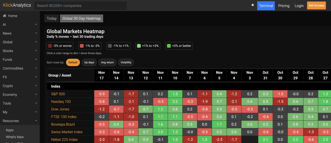
🚀 New in KlickAnalytics: Global 30-Day Market Wall
We’ve shipped a new dashboard tool designed to give you a true “terminal snapshot” of global markets in seconds.
What it does:
- Shows daily % moves for the last 30 trading days in a single heatmap
- Covers global indices, key commodities, crypto majors, agri contracts and FX pairs
- Groups assets by class so you can scan Commodities, Crypto, Currencies, etc. in one pass
- Lets you filter by move size using the color legend (e.g. focus only on +3% or worse days)
Lets you sort rows by:
- Up days (which assets have been consistently green)
- Average return (who’s trending)
- Volatility (where the real action is)
How to use it:
- 1) Open the “Global 30-Day Market Wall” in the dashboard.
- 2) Use the legend to highlight only the ranges you care about (for example, isolate the big selloff days).
- 3) Sort by Up, Avg, or Vol to surface opportunities or risks inside each group.
- 4) Click any asset name to jump straight into the full symbol view for deeper analysis.
This view is designed to be your new daily briefing:
one screen that tells you what’s been happening across the world in the last month – without opening ten different charts.
To access: From the Menu > Global > Today > Global 30-Day Wall
Added - Price Target Summary & Forecast
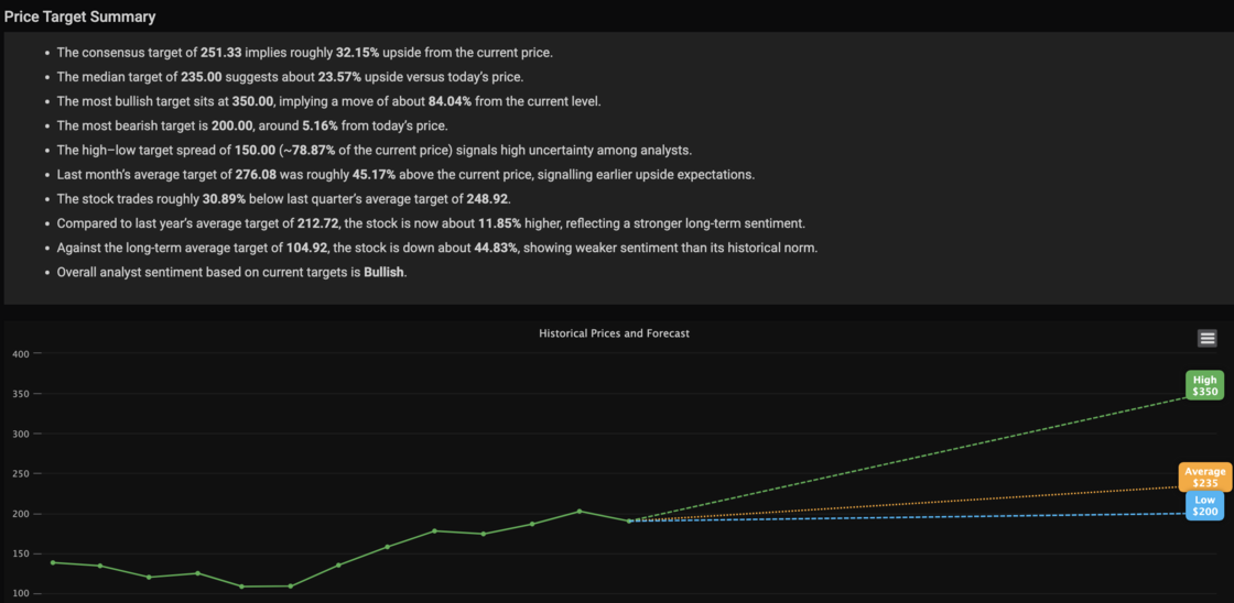
We’re excited to introduce a brand-new, powerful enhancement to your symbol research workflow — the Price Target Summary & Forecast Visualization.
This update brings analyst expectations to life with clear insights and an intuitive, interactive chart.
🔹 Smart Analyst Summary
For every symbol, you now get an instant, data-driven narrative summarizing:
Consensus, median, bullish, and bearish targets
Upside/downside percentages vs current price
Last month, last quarter, and last year target comparisons
Long-term sentiment vs historical norms
High–low target spread (market uncertainty indicator)
Overall analyst sentiment rating (Bullish / Neutral / Bearish)
All insights are computed dynamically based on the latest analyst data.
📈 Historical Prices + Forward Forecast Chart
The new chart overlays:
Historical monthly close prices
High analyst target
Average/consensus target
Low analyst target
Each forecast line includes a colored label box for quick identification (High, Average, Low).
The visual makes it effortless to understand:
How analysts see the stock moving
The range of expectations
Where the stock sits relative to its historical trend
These features will helps you:
Quickly assess analyst expectations
Spot shifts in sentiment
Compare short-term and long-term outlooks
Visualize risk/reward in one glance
Strengthen trading and investment decisions using cleaner intelligence
Whether you're researching a single stock or scanning multiple, this tool gives you an instant edge.
To access: Search for a symbol say NVDA and then go to Company > Price Target
⚡ Formula Scanner — Visualize Trading Logic Like Never Before
We’ve just launched the Formula Scanner, a powerful new way to turn your trading logic into visual signals and actionable insights — directly on the chart.
🔍 What It Does
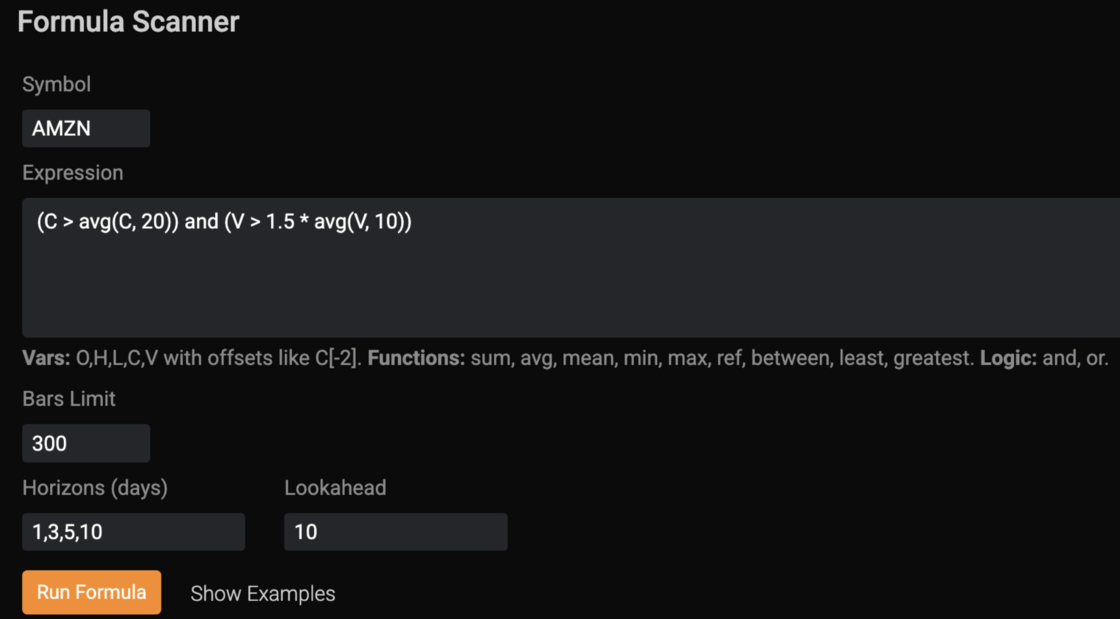
Define your very own custom trading condition using formulas with Open, High, Low, Close and Volume Prices like:
(C > avg(C, 20)) and (V > 1.5 * avg(V, 10))
Then click Run Formula — and the system will:
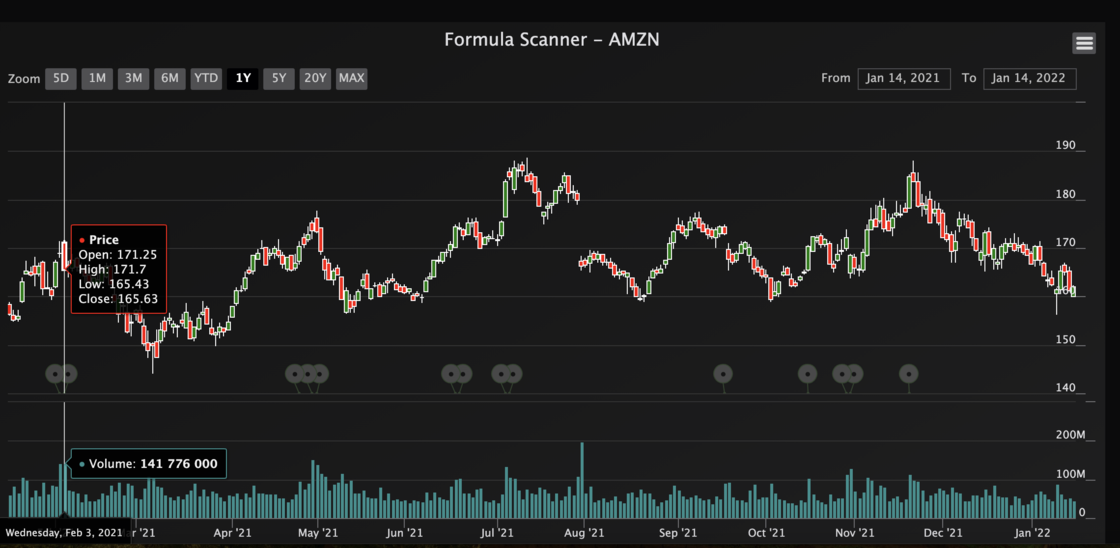
- Highlight matching events directly on the chart, showing every date your condition triggered.
- Generate detailed statistics across multiple horizons (1D, 3D, 5D, 10D) — including run-ups, drawdowns, and cumulative returns.
- List example events with full performance metrics for real backtesting context.
🧩 Features
Works with OHLCV data (O, H, L, C, V) and offsets like C[-2].
Supports built-in functions: sum, avg, mean, min, max, ref, between, least, greatest.
Logic operators: and, or, >, <, =, etc.
Dynamic horizons and lookahead windows for flexible event analysis.
Adjustable bars limit for faster scanning.
Full chart integration — see your signals visually, not just numerically.
📈 Benefits
Instantly test ideas — no need for complex coding or scripts.
See where your signal worked — visually on the price chart.
Understand performance distribution — best/worst runs, average outcomes, volatility after signal.
Turn formulas into trading logic that can evolve into automated strategies.
To access: From Menu > Tools > FormulaScanner
🔥 Now available in KlickAnalytics → Formula Scanner.
Build. Test. Visualize. — Your logic, your signals, your edge.
Ask the market a question. Get a calculated answer.
The AI is not a chatbot bolted onto a document store. It calls the same analytics engine that powers every screen on this platform — so what comes back is a number it computed from raw history, with the command that produced it.
86,000+ instruments
Global equities, ETFs, funds, options, FX, commodities, crypto, economics, filings, transcripts and news — one normalised symbol universe with adjusted history.
A real analytics engine
Screening, backtesting, technicals, options analytics, correlations, seasonality and factor models — computed on demand from raw prices, never a stale cache.
It shows its working
Answers arrive with the charts, tables and tool calls behind them, so you can check the number instead of trusting a paraphrase.
Your own documents
Upload filings, decks and research. Ask across them and the answer cites the page it came from.
Agents and workflows
Multi-step research that runs the platform's tools for you — screen, pull the history, compute, compare, then write it up.
MCP, CLI and API
The same command catalogue from Claude, your own agent, a shell or your pipeline. The answer on screen is the answer your job gets at 4am.
You ask
“How does NVDA usually trade through earnings?”
It calls
→ ka.options_expected_move(NVDA)
It answers
NVDA has averaged a 9.2% absolute move on the day after earnings and closed higher 67% of the time. Two in three reactions land between −4.2% and +16.3% — the distribution is skewed right, not symmetric.
Every figure computed live from our own history — not scraped, not summarised.
Or start with