What's New
Product updates, improvements and fixes across the KlickAnalytics platform.
142 updates · clear
The KlickAnalytics Help Centre

The KlickAnalytics Help Centre
Getting answers and learning how to use KlickAnalytics is now easier with our new Help Centre.
Search for help or explore organized guides covering:
-
Getting started with KlickAnalytics
-
Using individual apps and understanding their data
-
Managing your account, team, and notifications
-
Plans, subscriptions, and billing
-
Data sources, history, and validation
-
Troubleshooting common issues and contacting support
Open the Help Centre without leaving your current workspace, or expand it into a full window for a more focused experience.
Find answers faster. Learn every feature. Get more from KlickAnalytics.
Faster Access to Everything That Matters
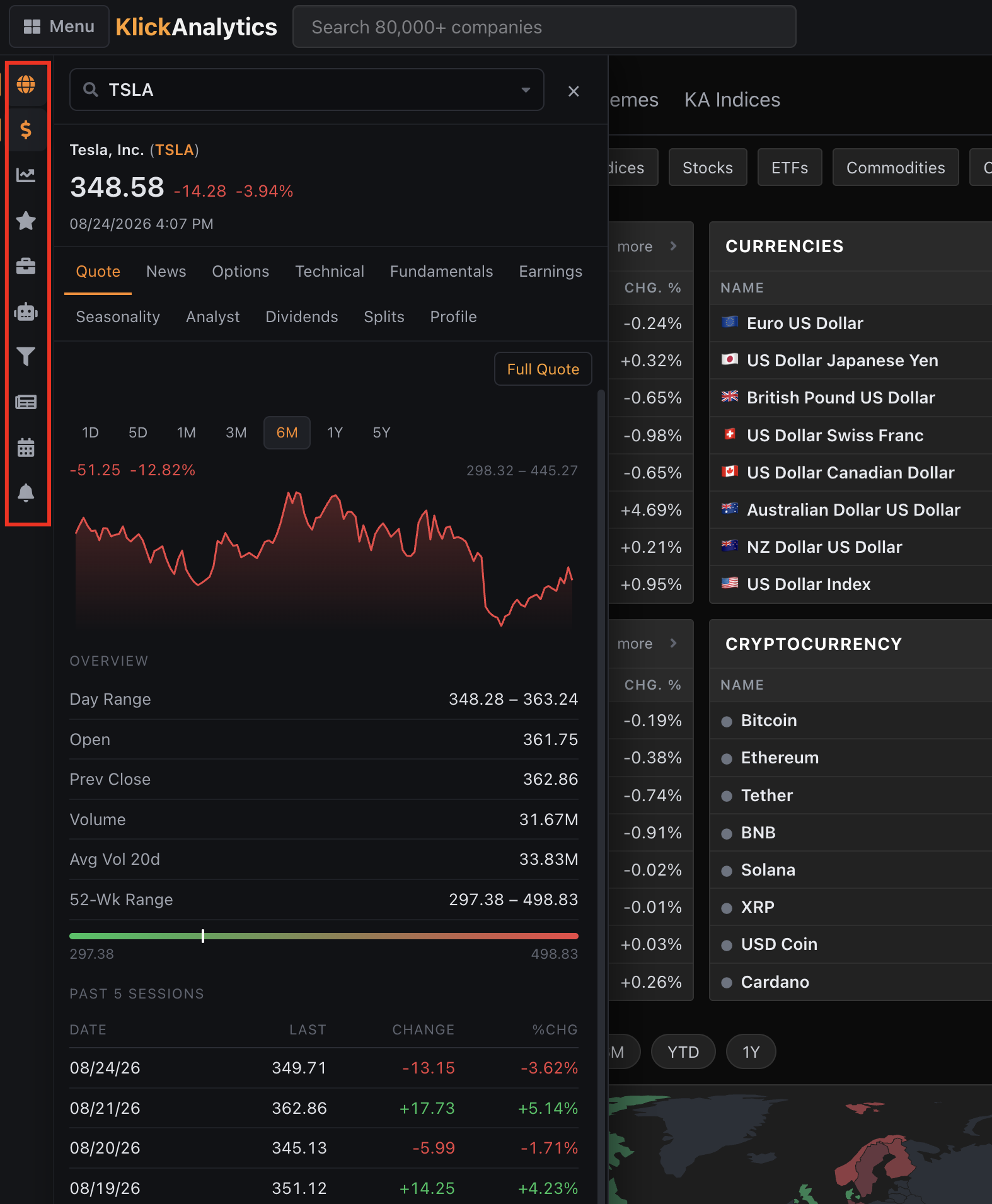
Faster Access to Everything That Matters
KlickAnalytics now makes it easier to move between your most-used market tools through a new quick-access sidebar.
With a single click, you can instantly open:
-
World markets
-
Symbol search and quotes
-
Interactive charts
-
Watchlists and portfolios
-
AI-powered market intelligence
-
Screeners and research tools
-
News and market updates
-
Economic calendars
-
Alerts and notifications
You can also search for any symbol and immediately view its price, performance chart, news, options, technicals, fundamentals, earnings, seasonality, analyst insights, dividends, splits, and company profile—without leaving your current page.
Less navigation. Faster research. Everything you need, always within reach.
Global Markets at a Glance
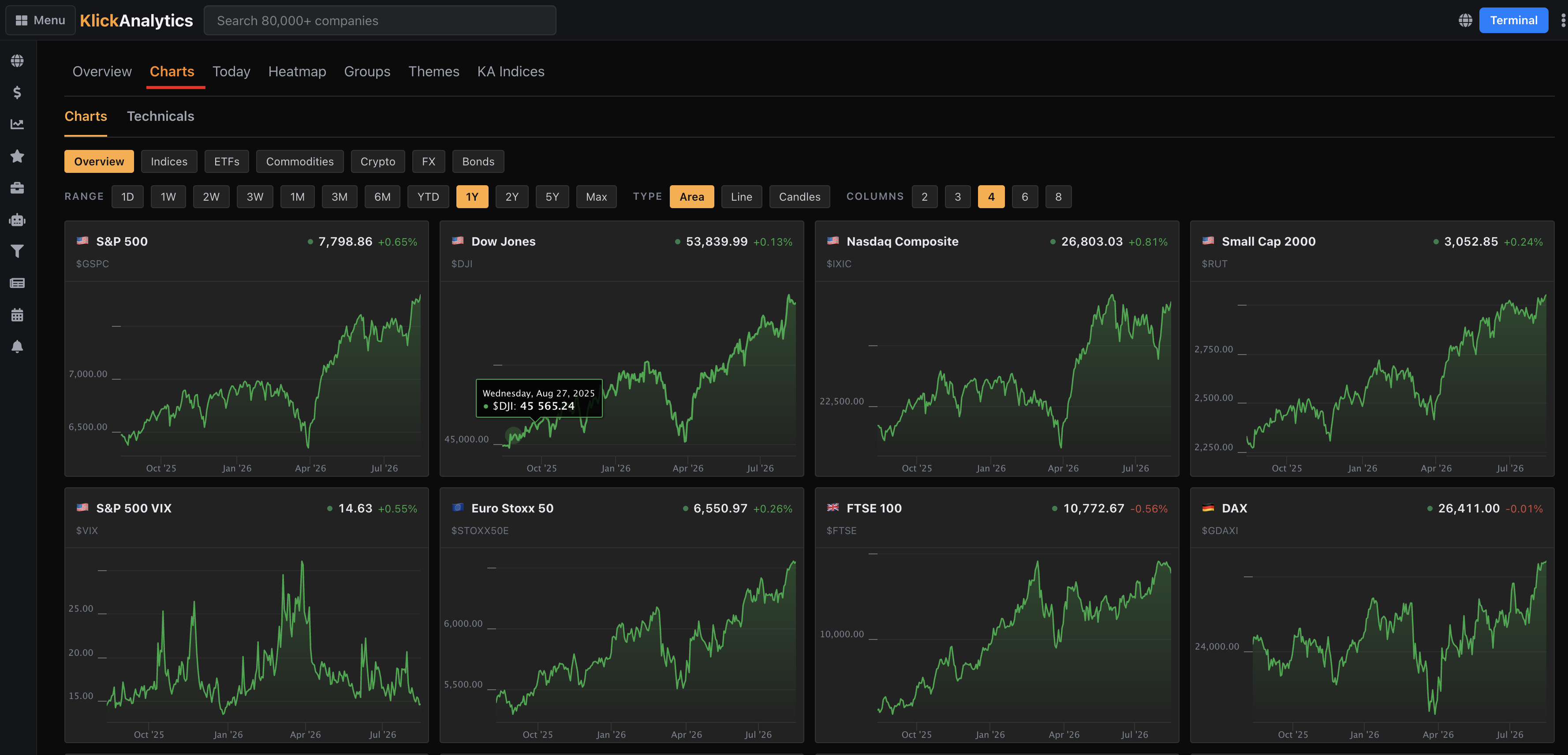
KlickAnalytics now makes it easier to monitor the world’s major financial instruments—all in one powerful, visual workspace.
Explore markets by asset class and category, including:
- Global indices and market benchmarks
- ETFs
- Commodities
- Cryptocurrencies
- Foreign exchange
- Bonds and fixed income
Instantly compare live prices, daily performance, historical trends, interactive charts, and technical indicators across multiple instruments—without switching between pages.
Customize the experience by selecting your preferred time range, chart type, asset category, and number of columns. Whether you’re tracking equities, volatility, currencies, commodities, or global markets, you can now spot trends, compare performance, and assess technical conditions at a quick glance.
Every major market. Charts and technicals. One unified view.
Understand What’s Really Driving a Stock’s Move
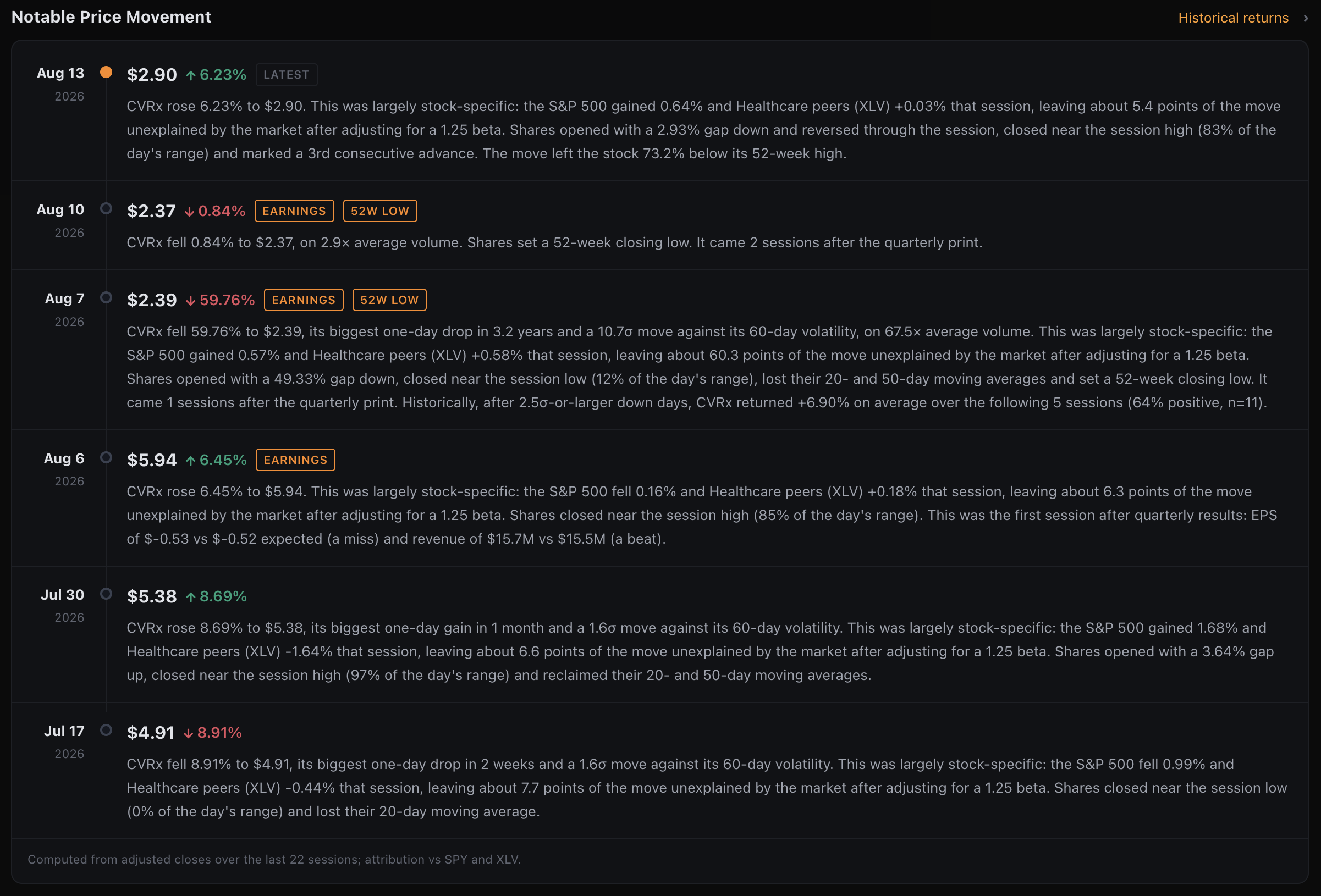
KlickAnalytics now automatically identifies and explains notable price movements for any stock—turning sudden market moves into clear, actionable intelligence.
Quickly see:
-
Whether the move was stock-specific or driven by the broader market
-
How the move compares with the stock’s historical volatility
-
Unusual trading volume and opening gaps
-
Earnings-related movements and 52-week highs or lows
-
Changes around key moving averages
-
Where the stock closed within the day’s trading range
-
Historical returns following similar price movements
No more guessing why a stock moved. KlickAnalytics gives you the complete context behind the move—all in one place.
To access: Search any symbol, and then on the overview page, you will see Notable Price Movement
Ask AI—Anywhere in KlickAnalytics
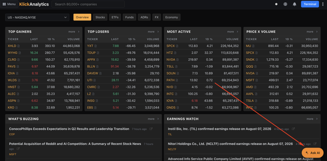
A new floating Ask AI button is now available across KlickAnalytics, giving users instant access to financial intelligence without leaving the page. Ask questions about stocks, markets, earnings, technical indicators, portfolios, economic data, or anything currently displayed on your screen.
Whether you need a quick explanation, deeper analysis, a market summary, or help finding the right data, KlickAnalytics AI is always one click away.
To access: This is available on all screen, just look for a floating ask AI button
🔔 Introducing the Notification Center
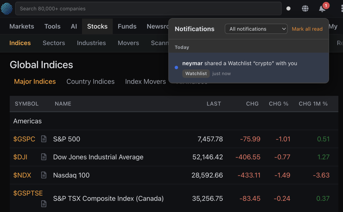
Stay in the loop the moment your team shares work with you — without ever leaving your workflow.
We've added a Notification Center to the KlickAnalytics header. Whenever a teammate shares a resource with you, a bell notification appears in real time — so nothing your team builds slips through the cracks.
What's New
- Header bell with live unread count — a badge shows how many notifications you haven't seen yet, updating instantly.
- Real-time delivery — the moment someone shares a Watchlist, Screener, Chart, or any resource with you, it pops up. No refresh needed.
- One click to the source — open a notification and jump straight to the shared resource.
- Filter by type — narrow the list to just Watchlists, Screeners, Charts, and more.
- Read / unread at a glance — a blue dot marks what's new; it turns gray once you've seen it. Clear everything with Mark all read.
- Always accurate — if a share is later revoked, its notification disappears automatically.
Why It Matters
- Never miss shared work — team collaboration surfaces immediately, right where you already are.
- Stay in the platform — no more pinging on Slack or email to say "I shared it with you."
- Less noise, more signal — filters and read-state keep your inbox focused on what's relevant.
Look for the 🔔 in the top navigation — it's live now.
To access: On top header, click on the notification icon to display all your notifications.
🚀 Introducing the New KlickAnalytics Strategy Builder
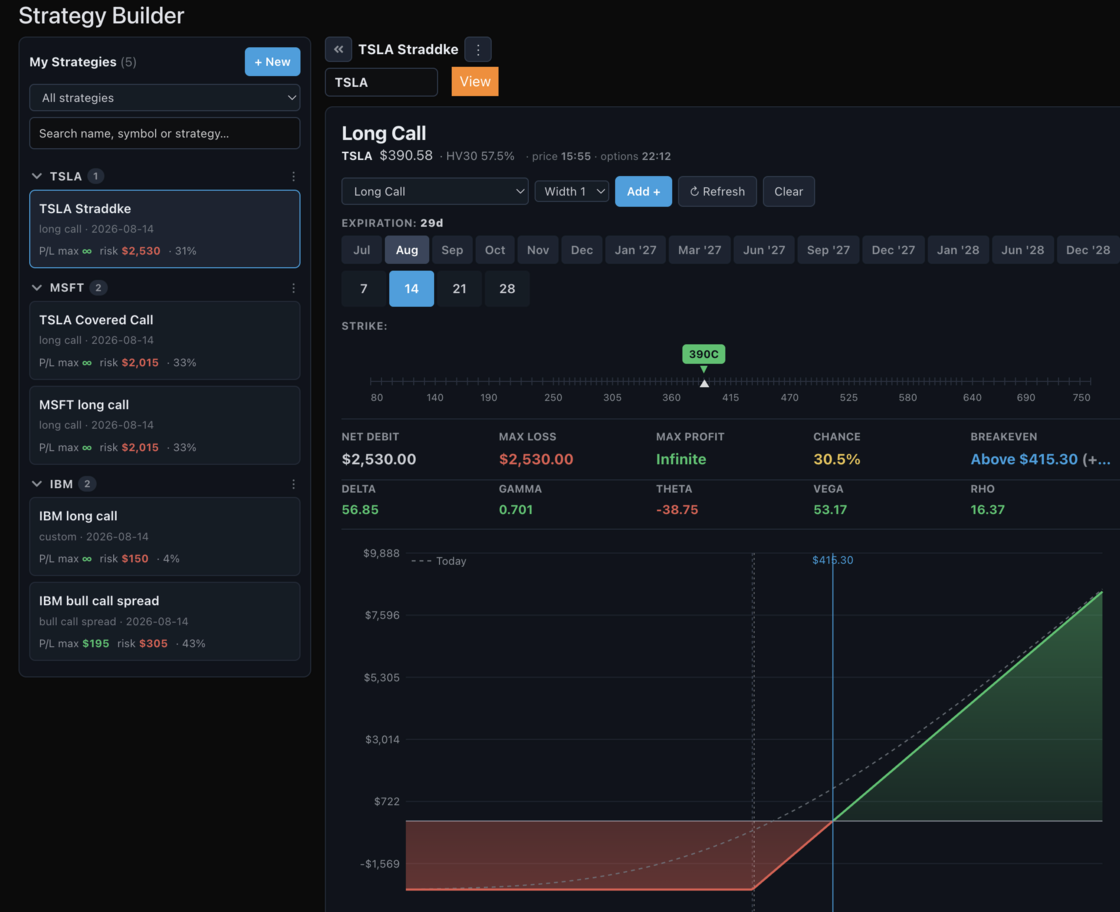
Build, analyze, save, and manage your options strategies from one powerful workspace.
- Create, edit, delete, duplicate, and share strategies with your team.
- Access all major options strategies or build custom multi-leg positions
- Choose expirations, strikes, quantities, and buy/sell directions
- Visualize potential outcomes with interactive payout diagrams
- Review maximum profit, maximum loss, breakeven, probability, and net debit or credit
- Analyze Delta, Gamma, Theta, Vega, and Rho
- Adjust the analysis date, price range, and implied volatility
- Switch between graph, table, dollar P&L, percentage return, contract value, and maximum-risk views
- Save and organize strategies by symbol for easy access
From long calls and covered calls to spreads, straddles, strangles, iron condors, and fully customized strategies—the new Strategy Builder gives you the tools to clearly understand every opportunity and its potential risk.
Build the strategy. Understand the risk. Visualize the opportunity.
To access: From the top menu, click on Options
Introducing the Option Calculator
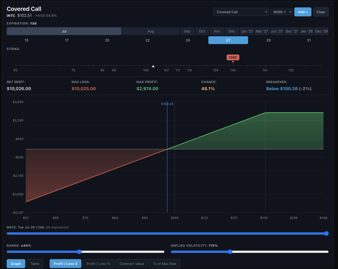
Fifty-eight strategies. One canvas. Every payoff, breakeven, Greek and probability — live, and yours to bend.
FIFTY-EIGHT STRATEGIES, FROM FIRST TRADE TO MASTER CLASS From the humble Long Call to the Double Diagonal, arranged across four tiers — Novice, Intermediate, Advanced, Expert. Choose one and it assembles itself from the live chain, priced to the real bid and ask.
BUILD IT LEG BY LEG
Buy or sell calls, puts, or the underlying itself. Add a leg, drop a leg, flip a side, change the size. The position is yours to shape — there is no strategy we can name that you cannot build by hand.
DRAG A STRIKE. WATCH THE WORLD MOVE.
Take hold of any strike and slide it along the ruler. The payoff curve, the breakevens, the Greeks and the odds all redraw beneath your finger, instantly.
THE DIAGRAM THAT TELLS THE WHOLE TRUTH
Profit in green, loss in red, breakevens marked, every strike traced. Hover anywhere along it to read your exact profit or loss at any price.
TRAVEL THROUGH TIME
The date slider prices your position on any day between today and expiration — carrying full Black-Scholes time value, not merely the hockey stick you get at the end. Watch theta do its quiet work.
BEND VOLATILITY TO YOUR WILL
Drive implied volatility from a quarter to triple. See precisely what a volatility crush — or an earnings shock — would do to your position, before it ever does it.
THE NUMBERS THAT DECIDE EVERYTHING
Net debit or credit. Maximum profit. Maximum loss. Breakeven. Probability of profit. And on the line beneath: net delta, gamma, theta and vega. No hunting. No guessing.
FOUR LENSES ON THE SAME TRADE
Profit and loss in dollars, or in percent. Contract value. Percent of maximum risk. As a graph, or as a table. Look at it however you think.
HONEST MATH
A covered call cannot lose more than its cost basis. A long put cannot profit beyond its strike. A calendar cannot lose more than its debit.
We compute what is true — not what is convenient.
To access: Search for any symbol say TSLA and then click on Analysis > Options > Calculator
Candlestick Patterns Analysis
Every charting platform will tell you a Morning Star is a bullish reversal. None of them will tell you whether it has ever actually worked on the stock you're looking at.
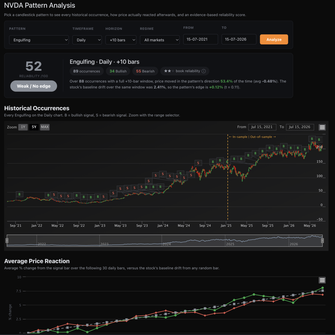
Today we're shipping a rebuilt Technicals section — including Pattern Analysis, an evidence engine that back-tests all 24 candlestick patterns against a symbol's own price history and scores them on what really happened next.
Technicals → Overview
- Summary, Technical Indicators and Moving Averages gauge meters at a glance
- 12 indicators — RSI, STOCH, STOCHRSI, MACD, ADX, Williams %R, CCI, ATR, Highs/Lows, Ultimate Oscillator, ROC, Bull/Bear Power — each with a Buy/Sell/Neutral call
- Moving Averages (SMA + EMA, 5 through 200) and Pivot Points across five methods: Classic, Fibonacci, Camarilla, Woodie's and DeMark's
- Daily, Weekly and Monthly timeframes
Technicals → Candle Patterns
- Interactive candlestick chart with every pattern flagged directly on the bars
- 24 patterns detected across Daily, Weekly and Monthly, split into Emerging and Completed
- Filter instantly by timeframe, pattern indication, type and reliability — chart and table update together, with no page reload
Technicals → Pattern Analysis — the new engine
- Pick any pattern and see every historical occurrence marked on the chart
- Average Price Reaction — how price actually moved over the following bars, plotted against the stock's own baseline drift
- Forward Return Statistics at any horizon from +1 to +30 bars: win rate, average and median return, baseline, edge, MFE/MAE and t-statistic
- Occurrence Detail — every signal, its real forward returns, and whether it worked or failed
- Pattern Leaderboard — all 24 patterns ranked for your symbol, answering "which of these actually work here?"
- Market-regime filter — test a pattern only in uptrends or only in downtrends. Many patterns behave completely differently depending on the trend they appear in
- Custom date range — analyse any window you like
What makes this different
Most pattern tools show you a win rate and stop. A win rate is easy to fake:
- We measure edge, not just wins. A 57% win rate sounds great until you learn the stock rose 56% of the time anyway. We subtract the symbol's own baseline drift, so you see what the pattern contributed — not what the market gave you for free.
- We don't trust small samples. A pattern that went 2-for-2 isn't a 100% pattern. Scores are shrunk by sample size, and anything under 10 occurrences is flagged as untrustworthy rather than celebrated.
- We validate out-of-sample. Every pattern is fitted on the first 70% of history and re-tested on the 30% it has never seen. An edge that only exists in the data it was found in isn't an edge.
- We show you the odds of fooling yourself. Test 24 patterns and roughly one will look significant by pure chance. We print that number next to the survivor count, so you know what "significant" is actually worth.
The honest part
We ran this on TSLA. Zero of 24 patterns survived out-of-sample. One that looked outstanding in-sample — a 68% win rate and a t-statistic above 3 — collapsed the moment it met unseen data.
We could have hidden that. Instead it's the whole point. Pattern Analysis is built to tell you when a pattern is real, and — far more often — when it isn't. That's worth more than another green arrow.
Available now on any global symbol under Technicals → Pattern Analysis. Gauges, charts and pattern detection are open to all users; reliability scores, edge figures and out-of-sample validation are part of Terminal.
To view: Search for any symbol say NVDA, and then click on Overview > Technical > Chart Patterns
Read Options Sentiment at a Glance
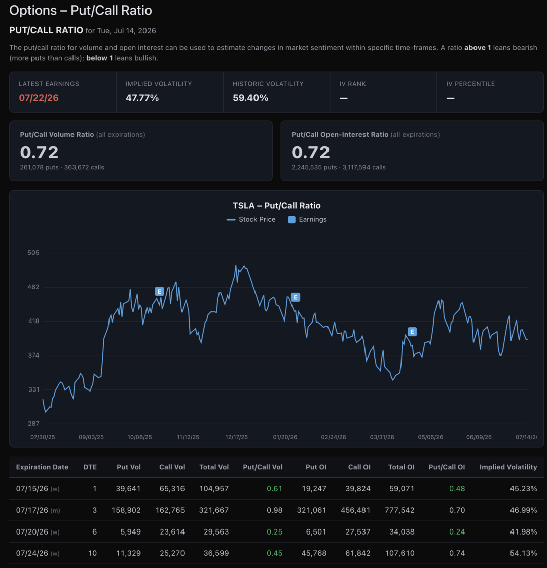
KlickAnalytics now provides a complete Put/Call Ratio analysis for any supported global symbol, helping you quickly understand whether options activity is leaning bullish or bearish.
View both the Put/Call Volume Ratio and Put/Call Open-Interest Ratio across all expirations, along with the underlying put and call totals behind each calculation.
The historical chart places current sentiment in context alongside the stock price and prior earnings events, while the expiration-level table lets you compare:
- Put and call volume
- Put and call open interest
- Put/Call ratios by expiration
- Days to expiration
- Total options activity
- Implied volatility**
A ratio above 1 generally indicates heavier put activity and a more bearish tilt, while a ratio below 1 suggests stronger call activity and a more bullish tilt.
Use it to quickly identify shifts in market positioning, unusual options activity, and differences in sentiment across upcoming expiration dates.
To View: Search for a symbol say TSLA, and the click on Analysis > Options > Put/Call Ratio
Ask the market a question. Get a calculated answer.
The AI is not a chatbot bolted onto a document store. It calls the same analytics engine that powers every screen on this platform — so what comes back is a number it computed from raw history, with the command that produced it.
86,000+ instruments
Global equities, ETFs, funds, options, FX, commodities, crypto, economics, filings, transcripts and news — one normalised symbol universe with adjusted history.
A real analytics engine
Screening, backtesting, technicals, options analytics, correlations, seasonality and factor models — computed on demand from raw prices, never a stale cache.
It shows its working
Answers arrive with the charts, tables and tool calls behind them, so you can check the number instead of trusting a paraphrase.
Your own documents
Upload filings, decks and research. Ask across them and the answer cites the page it came from.
Agents and workflows
Multi-step research that runs the platform's tools for you — screen, pull the history, compute, compare, then write it up.
MCP, CLI and API
The same command catalogue from Claude, your own agent, a shell or your pipeline. The answer on screen is the answer your job gets at 4am.
You ask
“How does NVDA usually trade through earnings?”
It calls
→ ka.options_expected_move(NVDA)
It answers
NVDA has averaged a 9.2% absolute move on the day after earnings and closed higher 67% of the time. Two in three reactions land between −4.2% and +16.3% — the distribution is skewed right, not symmetric.
Every figure computed live from our own history — not scraped, not summarised.
Or start with